
DEPMatrix
Four products from one company that no longer looked related, built on three diverging forks of MUI.
- Client
- B2B SaaS, four-product suite
- Year
- 2024
- Duration
- 21 weeks + 6 weeks of office hours
- Team
- 1 designer, 1 front-end engineer
- Role
- Design system + front-end
- Type
- Systems
- Approach
- Figma variables · Style Dictionary · React · Storybook · axe-core in CI
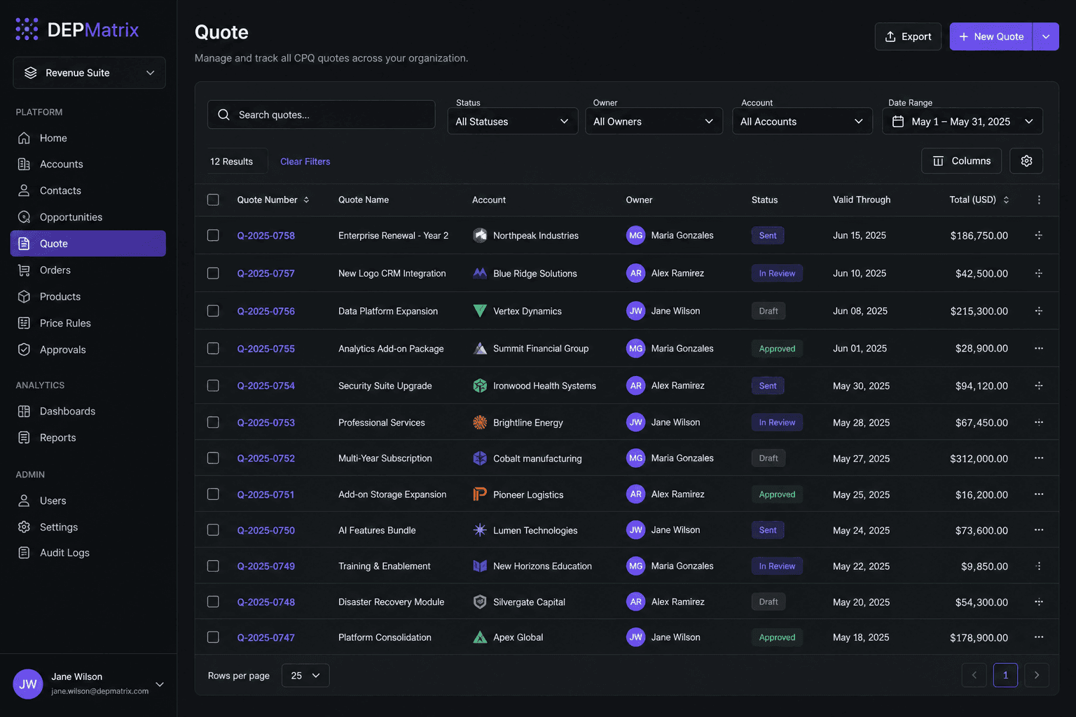
Audit findings, token pipeline and cutover order.
The audit
Quoting, order fulfillment, a mobile web app for field technicians, and an admin console. Each team had forked MUI at a different time and customized it separately. We screenshotted every primary screen and sorted the parts. There were 11 button styles, 7 table styles, 9 input styles and 4 different navigation shells. Support had a saved reply explaining which blue button to click.
What we didn't standardize
The fulfillment team's packing grid needed drag-to-pack, cell-level highlighting and keyboard shortcuts that would have made the shared table worse for everyone else. It stays local, and the contribution rules say so in writing. Field technicians use tablets outdoors, so larger touch targets come from a density token, not a separate set of components.
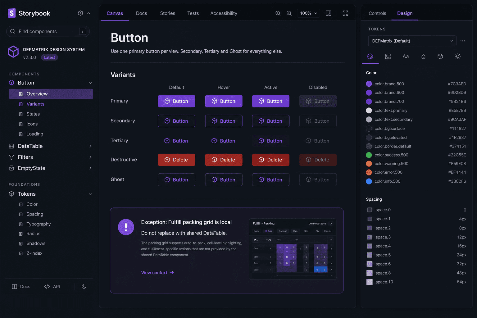
Button documentation in Storybook, with the packing-grid exception called out.
Tokens to code
Tokens live as Figma variables and build through Style Dictionary into CSS custom properties and TypeScript types. The React package is versioned with a changelog, and every component has Storybook stories. axe-core runs on every story in CI, and contrast or labeling failures block the merge. While apps were mid-migration, a temporary MUI theme generated from the same tokens kept old screens matching new ones.
Rollout
Each product team migrated its own screens. We paired with them and reviewed. Admin went first because it was mostly forms and had the fewest users. Field went last because it needed testing on real devices outdoors. Teams kept shipping features throughout.
Outcome
All 38 primary screens use the shared package, which has 46 components. UI inconsistency tickets went from 31 in the quarter before rollout to 6 in the quarter after. The client's two designers and front-end lead own the library now.
Scope
- Component audit across four apps
- Figma library and token pipeline
- React component package with Storybook docs
- Accessibility checks in CI
- Migration support for 38 screens, paired with each product team
- Contribution rules, including the packing-grid exception
- Handover and six weeks of office hours